ISO 19809:2017
(Main)Packaging — Accessible design — Information and marking
Packaging — Accessible design — Information and marking
ISO 19809:2017 provides requirements and recommendations concerning accessible design of consumer packaging with regard to information and marking. This document specifies considerations and methods for designing and presenting information and marking to make consumer packages accessible to people with the widest range of capabilities by considering their sensory and cognitive abilities. This document applies to all types of information and marking presented on consumer packaging. Specifically excluded from this document are information and marking for medicinal products and medical devices including tamper verification. The design considerations and methods specified in this document are primarily intended for designers, developers and evaluators of packaging.
Emballages — Conception accessible — Informations et marquage
General Information
- Status
- Published
- Publication Date
- 27-Nov-2017
- Technical Committee
- ISO/TC 122 - Packaging
- Drafting Committee
- ISO/TC 122/WG 9 - Accessible design for packaging
- Current Stage
- 9093 - International Standard confirmed
- Start Date
- 13-Aug-2023
- Completion Date
- 12-Feb-2026
Overview
ISO 19809:2017 - Packaging - Accessible design - Information and marking - defines requirements and recommendations for making consumer packaging information and marking accessible to people with a wide range of sensory and cognitive abilities. The standard guides how text, symbols, tactile features, colour and alternative formats should be designed and presented to improve legibility, comprehension and safe use. (Note: information and marking for medicinal products and medical devices including tamper verification are excluded.)
Key topics and technical requirements
ISO 19809:2017 covers practical design considerations and evaluation methods, including:
- User- and context-focused design: consider diverse users (age, sensory, cognitive, cultural differences) and varying environments (lighting, tasks).
- Multiple presentation methods: provide at least two ways to convey critical information (visual + tactile, visual + audio, symbols + words, ICT tags/barcodes).
- Simplicity and clarity: use simple language, consistent expressions, prioritized information hierarchy and clear pictograms to reduce cognitive load.
- Highlighting important information: differentiate crucial markings by colour, texture, size or font to aid quick identification.
- Legibility factors: address luminance contrast, colour combinations, letter form and size, avoidance of glare, and logical placement of information.
- Tactile and audio alternatives: tactile markings, Braille (referencing relevant Braille guidance), and auditory signals where appropriate.
- Packaging-specific issues: consider how opening methods, use instructions, storage and disposal information affect accessibility.
- Evaluation and conformance: recommends both instrument-based (measurements) and user-based (testing with representative users) evaluations, and includes checklists and annexes (types of disabilities, tactile dimensions, designer’s checklist).
Applications and who should use it
ISO 19809:2017 is intended primarily for:
- Packaging designers and developers
- Accessibility specialists and usability evaluators
- Product managers, brand teams and manufacturers
- Quality assurance and regulatory staff
- Retailers and supply chain designers
Practical uses include designing consumer labels and markings that are more inclusive, improving product usability for older adults and people with disabilities, ensuring compliance with accessibility best practices, and guiding user testing and conformance assessment.
Related standards (select)
- ISO 3864-1 - Graphical symbols and safety colours
- ISO 17351 - Braille on packaging for medicinal products
- ISO 21067-1 - Packaging vocabulary
- ISO 24503 - Tactile dots and bars on consumer products
- ISO 8317 - Child-resistant packaging
Keywords: ISO 19809:2017, accessible design, packaging, information and marking, consumer packaging, tactile, Braille, luminance contrast, pictograms, inclusive design.
Get Certified
Connect with accredited certification bodies for this standard

BRCGS (Brand Reputation Compliance Global Standards)
Global food safety and quality standards owner.
Sponsored listings
Frequently Asked Questions
ISO 19809:2017 is a standard published by the International Organization for Standardization (ISO). Its full title is "Packaging — Accessible design — Information and marking". This standard covers: ISO 19809:2017 provides requirements and recommendations concerning accessible design of consumer packaging with regard to information and marking. This document specifies considerations and methods for designing and presenting information and marking to make consumer packages accessible to people with the widest range of capabilities by considering their sensory and cognitive abilities. This document applies to all types of information and marking presented on consumer packaging. Specifically excluded from this document are information and marking for medicinal products and medical devices including tamper verification. The design considerations and methods specified in this document are primarily intended for designers, developers and evaluators of packaging.
ISO 19809:2017 provides requirements and recommendations concerning accessible design of consumer packaging with regard to information and marking. This document specifies considerations and methods for designing and presenting information and marking to make consumer packages accessible to people with the widest range of capabilities by considering their sensory and cognitive abilities. This document applies to all types of information and marking presented on consumer packaging. Specifically excluded from this document are information and marking for medicinal products and medical devices including tamper verification. The design considerations and methods specified in this document are primarily intended for designers, developers and evaluators of packaging.
ISO 19809:2017 is classified under the following ICS (International Classification for Standards) categories: 55.020 - Packaging and distribution of goods in general. The ICS classification helps identify the subject area and facilitates finding related standards.
ISO 19809:2017 is available in PDF format for immediate download after purchase. The document can be added to your cart and obtained through the secure checkout process. Digital delivery ensures instant access to the complete standard document.
Standards Content (Sample)
INTERNATIONAL ISO
STANDARD 19809
First edition
2017-11
Packaging — Accessible design —
Information and marking
Emballages — Conception accessible — Informations et marquage
Reference number
©
ISO 2017
© ISO 2017, Published in Switzerland
All rights reserved. Unless otherwise specified, no part of this publication may be reproduced or utilized otherwise in any form
or by any means, electronic or mechanical, including photocopying, or posting on the internet or an intranet, without prior
written permission. Permission can be requested from either ISO at the address below or ISO’s member body in the country of
the requester.
ISO copyright office
Ch. de Blandonnet 8 • CP 401
CH-1214 Vernier, Geneva, Switzerland
Tel. +41 22 749 01 11
Fax +41 22 749 09 47
copyright@iso.org
www.iso.org
ii © ISO 2017 – All rights reserved
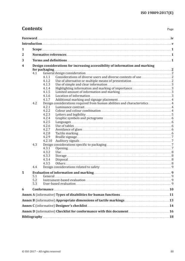
Contents Page
Foreword .iv
Introduction .v
1 Scope . 1
2 Normative references . 1
3 Terms and definitions . 1
4 Design considerations for increasing accessibility of information and marking
for packaging . 2
4.1 General design consideration . 2
4.1.1 Considerations of diverse users and diverse contexts of use . 2
4.1.2 Use of alternative or multiple means of presentation . 2
4.1.3 Use of simple and clear information . 3
4.1.4 Highlighting information and marking of importance . 3
4.1.5 Limited amount of information and marking . 3
4.1.6 Location of information . 3
4.1.7 Additional marking and signage placement . 4
4.2 Design considerations required from human abilities and characteristics. 4
4.2.1 Luminance contrast . 4
4.2.2 Colour and colour combination . 4
4.2.3 Letters and legibility . 5
4.2.4 Graphic symbols and pictograms . 6
4.2.5 Languages . 6
4.2.6 Use of tables . 6
4.2.7 Avoidance of glare . 6
4.2.8 Tactile marking . 6
4.2.9 Braille signage . 7
4.2.10 Auditory signals . 7
4.3 Design considerations specific to packaging . 7
4.3.1 Opening . 7
4.3.2 Use . 8
4.3.3 Storage . 8
4.3.4 Disposal . 8
4.3.5 Others . 8
4.4 Design considerations related to safety . 9
5 Evaluation of information and marking . 9
5.1 General . 9
5.2 Instrument-based evaluation . 9
5.3 User-based evaluation . 9
6 Conformance .10
Annex A (informative) Types of disabilities for human functions .11
Annex B (informative) Appropriate dimensions of tactile markings .13
Annex C (informative) Designer’s checklist .14
Annex D (informative) Checklist for conformance with this document .16
Bibliography .18
Foreword
ISO (the International Organization for Standardization) is a worldwide federation of national standards
bodies (ISO member bodies). The work of preparing International Standards is normally carried out
through ISO technical committees. Each member body interested in a subject for which a technical
committee has been established has the right to be represented on that committee. International
organizations, governmental and non-governmental, in liaison with ISO, also take part in the work.
ISO collaborates closely with the International Electrotechnical Commission (IEC) on all matters of
electrotechnical standardization.
The procedures used to develop this document and those intended for its further maintenance are
described in the ISO/IEC Directives, Part 1. In particular, the different approval criteria needed for the
different types of ISO documents should be noted. This document was drafted in accordance with the
editorial rules of the ISO/IEC Directives, Part 2 (see www.iso.org/directives).
Attention is drawn to the possibility that some of the elements of this document may be the subject of
patent rights. ISO shall not be held responsible for identifying any or all such patent rights. Details of
any patent rights identified during the development of the document will be in the Introduction and/or
on the ISO list of patent declarations received (see www.iso.org/patents).
Any trade name used in this document is information given for the convenience of users and does not
constitute an endorsement.
For an explanation on the voluntary nature of standards, the meaning of ISO specific terms and
expressions related to conformity assessment, as well as information about ISO's adherence to the
World Trade Organization (WTO) principles in the Technical Barriers to Trade (TBT), see the following
URL: www.iso.org/iso/foreword.html.
This document was prepared by Technical Committee ISO/TC 122, Packaging.
iv © ISO 2017 – All rights reserved
Introduction
In our aging and welfare-oriented society, there is an increasing awareness of full and effective
participation of older persons and persons with disabilities in society on an equal basis. A common
challenge facing the packaging industry in the world is to develop packages which have clear information
and marking necessary for use and purchase that are understandable for the widest possible range of
users, including older persons and persons with disabilities.
Information and marking on packaging go beyond ensuring safety and security to also add more value
to the packaged products for older persons and persons with disabilities. When designing packaging
that is expected to ensure accurate and appropriate information, greater consideration is required
for increasing accessibility to the packaged products for older persons and persons with disabilities.
Such persons sometimes have difficulties in obtaining and understanding the information conveyed by
labelling and other means of information technologies such as a bar code read by a smart phone.
Noting that the degree of comprehension for information and marking can vary widely according to age
and human abilities such as sensory and cognitive abilities, this document addresses essential points to
enhance the accessibility of information and marking in packaging in the concept s and goals which are
[11] [8]
expressed in ISO/IEC Guide 71 and ISO/TR 22411 .
INTERNATIONAL STANDARD ISO 19809:2017(E)
Packaging — Accessible design — Information and marking
1 Scope
This document provides requirements and recommendations concerning accessible design of consumer
packaging with regard to information and marking.
This document specifies considerations and methods for designing and presenting information and
marking to make consumer packages accessible to people with the widest range of capabilities by
considering their sensory and cognitive abilities.
This document applies to all types of information and marking presented on consumer packaging.
Specifically excluded from this document are information and marking for medicinal products and
medical devices including tamper verification.
The design considerations and methods specified in this document are primarily intended for designers,
developers and evaluators of packaging.
2 Normative references
The following documents are referred to in the text in such a way that some or all of their content
constitutes requirements of this document. For dated references, only the edition cited applies. For
undated references, the latest edition of the referenced document (including any amendments) applies.
ISO 3864-1, Graphical symbols — Safety colours and safety signs — Part 1: Design principles for safety
signs and safety markings
ISO 8317, Child-resistant packaging — Requirements and testing procedures for reclosable packages
ISO 17351, Packaging — Braille on packaging for medicinal products
ISO 21067-1, Packaging — Vocabulary — Part 1: General terms
ISO 24503, Ergonomics — Accessible design --Tactile dots and bars on consumer products
3 Terms and definitions
For the purposes of this document, the terms and definitions given in ISO 21067-1 and the following apply.
ISO and IEC maintain terminological databases for use in standardization at the following addresses:
— IEC Electropedia: available at http://www.electropedia.org/
— ISO Online browsing platform: available at http://www.iso.org/obp
3.1
cognition
extent to which a user can understand the appropriate information as it is intended
[SOURCE: ISO 17480:2015, 3.5]
3.2
consumer packaging
packaging, constituting, with its contents, a sales unit to the final user or consumer at the point of retail
[SOURCE: ISO 17480:2015, 3.1]
3.3
context of use
combination of specified users, goals and tasks, resources and environment
Note 1 to entry: The environment in a context of use includes the technical, physical, social and organizational
environments.
[SOURCE: ISO 9241-11:1998, 3.5 — modified.]
3.4
instrument-based evaluation
evaluation that uses measurement instruments to obtain data
3.5
user-based evaluation
evaluation that uses a method involving users with or without the use of measurement instruments
and provides insight into the user's sensory, physical and cognitive aspects
3.6
tactile information
human sensory information generated by touch
Note 1 to entry: There are two types of touch sensing. One is passive and the other active, the latter being called
haptic. In this document, tactile information means both types of touch sensing.
4 Design considerations for increasing accessibility of information and marking
for packaging
4.1 General design consideration
4.1.1 Considerations of diverse users and diverse contexts of use
Designing information and marking of packaging shall consider on diverse users and diverse context
of use. Diverse users include users with different ages, genders, human abilities (sensory, physical
and cognitive), languages, as well as life styles and cultures. Context of use includes different
physical environments (lighting, thermal condition), tasks involved in and social and organizational
environments.
Annex A presents disabilities of human sensory, physical and cognitive abilities, and their consequences,
as well as aging effects.
4.1.2 Use of alternative or multiple means of presentation
Information and marking on packaging should be presented with at least two different means of
presentation for users who are unable to obtain some information due to their disabilities. Whenever
possible, multiple means of presentation should be employed to increase accessibility. Different means
include different sensory inputs/outputs, different modes of presentation within the same sensory
ability, e.g. colours and symbols, and different methods of presentation, e.g. printed letters and audio
information.
The following considerations may apply but are not restricted to the following:
— represent some or a whole part of the printed visual information by tactile or auditory information;
EXAMPLE 1 Braille used on medicinal packaging to present some of the printed information
(see ISO 17351).
— use colour information additionally to discriminate the different meanings of visual information
merely expressed by letters and symbols, or vice versa;
2 © ISO 2017 – All rights reserved
EXAMPLE 2 Marking of opening position by different colour from the background, in addition to
letters writing “open here”.
— provide symbols and pictograms in addition to the information merely expressed by letters, or
vice versa;
EXAMPLE 3 Marking of opening position by a scissors pictogram, in addition to letters writing
“open here”.
— provide ICT information in addition to printed information.
EXAMPLE 4 The bar code or the ICT tag of the package information.
4.1.3 Use of simple and clear information
Information and marking on packaging shall be simple and comprehensive for older people and people
with visual and cognitive disabilities to understand the meaning correctly and instinctively. Ambiguous
information and marking that cause misunderstanding and misidentification shall not be used.
The following considerations may apply but are not restricted to the following:
— use consistent expressions with common words, phrases, symbols and pictograms;
— select as little information as possible depending on the level of priority of the information;
— use a classification or hierarchy of the information when presenting;
— use graphic symbols or pictograms rather than long and complex wordings.
4.1.4 Highlighting information and marking of importance
Information and marking which are important for correct identification and use shall be clearly shown
by highlighting them with different features from the adjacent areas.
The following considerations may apply but are not restricted to the following:
— use different colour from the adjacent areas;
— use different texture from the adjacent areas;
— use different sizes or types of font, symbols and pictograms from the adjacent area;
— use different sizes or types of font, symbols and pictograms from the adjacent areas;
EXAMPLE Sans Serif words or sentences used in the Serif sentences.
— provide notes and/or examples when necessary.
4.1.5 Limited amount of information and marking
The amount of information and marking on packaging should not be too much to read or understand.
Important information shall be prioritized. Unnecessary, redundant and repeated information not
required shall be omitted.
The following consideration may apply but is not restricted to the following:
— related or a similar type of information is logically grouped and presented in the same area or in the
same style but not distributed separately nor in a different format.
4.1.6 Location of information
Appropriate positioning of information and marking shall be considered to avoid users missing or
overlooking the information on packaging.
The following considerations may apply but are not restricted to the following:
— information and marking on packaging should be clearly visible and legible;
— important information and markings shall not be lost or destroyed by opening and closing the
package (see 4.3.1);
— tactile marking and Braille should be located where users can easily find and touch them.
4.1.7 Additional marking and signage placement
The placement of additional marking and signage shall not reduce the legibility of printed text and
graphics for sighted people as well as the legally required statutory information to be labelled on the
packaging in the specific country or market.
NOTE 1 This is indicated when, for example, the application of Braille or additional marking corrupts printed
text and graphics.
NOTE 2 The manufacturer is encouraged to place the Braille or additional marking away from printed text
and graphics, where possible.
4.2 Design considerations required from human abilities and characteristics
4.2.1 Luminance contrast
Contrast between letters/symbols/pictograms and the background shall be set as high as possible to
ensure better visibility. However, too much glare can cause legibility problems.
The following considerations may apply but are not limited to the following:
— use black letters or symbols on white background where high luminance contrast is needed;
EXAMPLE Luminance contrast above 70 % is recommended (see Annex C).
— avoid glossy background that reduces the luminance contrast with reflected light;
— use negative contrast where symbols and letters are brighter than the background;
— avoid pale or light colour for letters and symbols on light background, and dark and deep colour on
dark background;
— estimate correct luminance contrast when coloured letters and symbols are used on coloured
background. When blue letters or symbols are used on dark background, the luminance contrast is
set larger for older people than that for younger people.
NOTE The method for estimating age-related luminance contrast for coloured lights is given in ISO 24502.
4.2.2 Colour and colour combination
Colour and colour combination should be used so that information and marking on packaging are more
visible and comprehensive than those not using colour. Selection of colour or colours for a combination
shall appropriately consider the user’s ability to perceive colour such as visual defects (e.g. colour
blindness) or low-light conditions.
The following considerations may apply but are not limited to the following:
— use basic colours for identification and marking;
NOTE 1 Basic colours include red, orange, yellow, green, blue, purple, pink, brown, white, grey and black.
— use colour consistently;
4 © ISO 2017 – All rights reserved
— avoid the red/green combination for users with colour defects;
— avoid blue on dark background for older users;
— avoid yellow on white background for older users;
— provide non-colour associated information such as text, symbols and texture when information
only depends on colour (see 4.1.2);
— follow ISO 3864-1 when information and marking are concerned with safety;
— consider the change of colour appearance in a dark environment;
NOTE 2 Red colour, of vivid tone in particular, is hard to see in a dark environment.
— use colours that belong to different basic colour groups to make the combination discriminable.
NOTE 3 The method for creating colour combinations based on basic colours for people at any age is
shown in ISO/TR 22411 and ISO 24505.
4.2.3 Letters and legibility
Letters, words and sentences on packaging shall be legible for the intended users and intended context
of use. Legible types and sizes of font for different, ages as well as for different types of disabilities shall
be appropriately selected. Considerations shall be given particularly on luminance level of viewing,
viewing distance, luminance contrast between letters and background (see 4.2.4) of the packaging
surface, colour of letters and background (see 4.2.3), location of letters, number of letters in one
sentence line and spacing between letters, words and lines.
The following considerations may apply but are not limited to the following:
— use relatively larger font sizes for older people in near viewing distance;
— use relatively larger font sizes for darker luminance/illuminance condition;
— use Sans Serif fonts rather than Serif fonts for better legibility;
— ensure that the ascenders of lower case characters project above the type height by approximately
20 %;
— ensure that lower case characters with descenders project below the line of text by approximately
20 %;
— avoid cursive text for sentences;
— avoid sentences with capital letters only;
— avoid sentences with italic letters only;
— keep appropriate inter-character spacing and inter-line spacing;
— provide negative polarity fonts (white letters on dark background) for users with low vision;
— provide much larger font sizes (about 10 times) for people with low vision;
— find the minimum legible font size for a combined condition of age, luminance level and viewing
distance and use it as a unit of legible font size.
NOTE 1 Information about minimum legible font size is shown in ISO/TR 22411.
NOTE 2 An example of a checklist is given in Annex C.
4.2.4 Graphic symbols and pictograms
Whenever possible, information and marking should use graphic symbols and pictograms to make the
meaning simple,
...


Questions, Comments and Discussion
Ask us and Technical Secretary will try to provide an answer. You can facilitate discussion about the standard in here.
Loading comments...