

SIST EN 18156:2026
(Main)Tactile lettering - Requirements on the presentation and application of Braille and raised characters
- Abstract
This document specifies requirements and technical specifications for information presented in tactile lettering in the built environment.
NOTE For the definition of built environment see ISO 21542.
It sets out rules for content, design, arrangement and application of information elements so that blind and partially sighted people are able to locate, identify, fluently read and interpret this information.
This document does not specify technical methods for producing tactile lettering.
This document is only applicable to permanently installed tactile lettering.
- Status
- Published
- Public Enquiry End Date
- 30-Mar-2025
- Publication Date
- 02-Nov-2026
- Technical Committee
- VAZ - Healthcare
- Current Stage
- 6060 - National Implementation/Publication (Adopted Project)
- Start Date
- 02-Nov-2026
- Due Date
- 07-Jan-2027
- Completion Date
- 03-Nov-2026

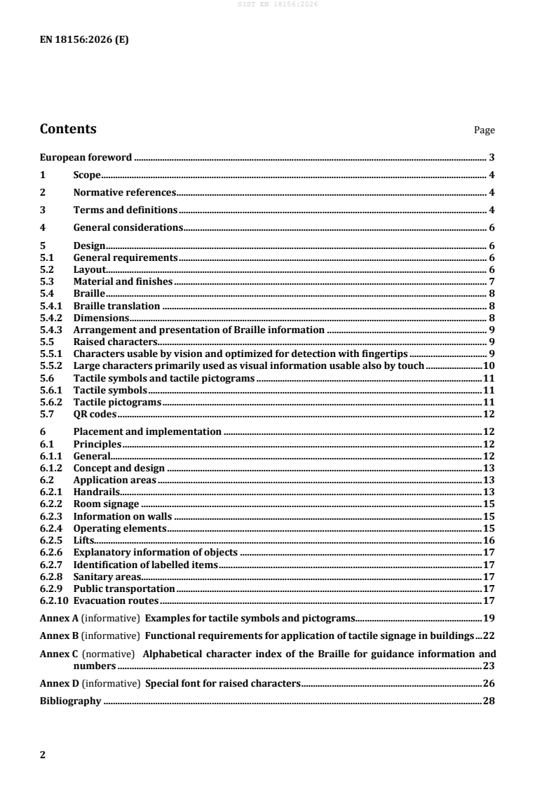
SIST EN 18156:2026 is the Slovenian standard for tactile lettering in the built environment. It sets requirements for how Braille and raised characters are presented and applied so blind and partially sighted people can locate, identify, read and interpret information. The standard applies to permanently installed tactile lettering and focuses on content, layout, placement and readability rather than on production methods.
What does SIST EN 18156:2026 specify?
SIST EN 18156:2026 specifies requirements and technical specifications for information presented in tactile lettering in the built environment. It covers how the information is designed, arranged and placed so that it can be used by blind and partially sighted people.
The standard applies only to permanently installed tactile lettering. It does not cover technical methods for making tactile lettering.
The document is organized into:
- Clause 1 Scope
- Clause 2 Normative references
- Clause 3 Terms and definitions
- Clause 4 General considerations
- Clause 5 Design
- Clause 6 Placement and implementation
- Annexes A to D
| Annex | What it covers |
|---|---|
| Annex A | Examples of tactile symbols and pictograms |
| Annex B | Functional requirements for applying tactile signage in buildings |
| Annex C | Alphabetical character index of the Braille for guidance information and numbers |
| Annex D | Special font given in DIN 32986 |
What are the key requirements of SIST EN 18156:2026?
SIST EN 18156:2026 is built around three practical ideas: tactile information must be readable by touch, it must also remain understandable by sight where possible, and it must be placed where users can find it predictably. In practice, that means the standard tells you what to show, how to form it, and where to put it.
Design and readability
- Tactile information shall be raised, not engraved, because engraved details are difficult to identify by touch. This matters when choosing signs, panels and labels, since a visually neat recess can still be unusable.
- Tactile lettering consists of Braille and raised characters, and the information in Braille and raised characters shall be identical. For longer text, the standard allows alternative formats such as QR codes, so the tactile message stays short and focused.
- Abbreviations should be used sparingly and only common ones should be used. This reduces ambiguity for users who depend on touch and may not be able to infer a shortened label.
- Directional information should be given with arrows, and pictograms should be avoided unless they are clearly tactile and easy to distinguish. The standard treats direction and identification as separate tasks, which helps prevent overcrowded signage.
Braille
- For guidance information and numbers, the six dot Braille code in Annex C shall be used. For additional information and longer text, national Braille should be applied, which keeps public information aligned with local Braille practice.
- Braille dimensions follow the Marburg spacing convention, with Marburg Large preferred for short guiding information and Marburg Medium used for operating elements and longer explanatory text. The practical effect is that sign manufacturers have a fixed geometry to follow, so the tactile pattern remains legible.
- Braille characters shall not be arranged vertically or in a non-linear form, and single letters, digits or numbers should align to a reference edge. This supports fluent reading by touch.
Raised characters, symbols and pictograms
- Raised characters intended for touch shall use capital letters, clear fonts, sufficient height and a pyramidal relief profile with rounded edges. The standard also recommends the special font given in DIN 32986 for optimized reading.
- Large characters used mainly for visual identification can also be made readable by touch if they have a raised profile and the required edge quality. This is useful for room numbers, floor numbers and similar labels that must work for both sight and touch.
- Tactile symbols are limited to a small set of recognizable forms such as arrows, triangles, open door, close door and bell. Annex A gives examples, which helps designers keep symbol sets consistent across a building.
Placement and application
- Tactile information shall be placed at predictable locations such as entrances, decision points, handrails, room doors, wall panels, operating elements and lifts. In practice, this supports orientation in buildings instead of forcing users to search for signs.
- The standard sets layout distances, clear spaces, and height ranges for room signs, wall information, handrails and controls. These placement rules matter because a sign can be technically correct but still fail if it is too high, too low or too close to an obstruction.
- For operating elements, lifts, sanitary areas and public transport, tactile lettering is tied to the actual control or label so the user can locate the function by touch. Where touch-sensitive controls are used, the standard requires additional measures such as acoustic confirmation and raised or bordered active surfaces.
- QR codes, when used, have defined size limits, a continuous tactile border and a Braille label “qr”. That makes the code easier to find and distinguishes it from the surrounding panel.
What terms does SIST EN 18156:2026 define?
- Braille - a tactile dot writing system used by people with a visual impairment.
- Raised characters - specially designed embossed letters and numbers that can be read by touch.
- Tactile lettering - information provided in both Braille and raised characters.
- Tactile symbol - a sign that can be identified and recognized by touch.
- Tactile pictogram - a graphic composition, including symbols and other graphic elements, intended to convey specific information by touch.
- Tactile walking surface indicator (TWSI) - a standardized walking surface used for information by blind or partially sighted people.
- Multiple senses - the design principle of using different sensory abilities, such as seeing, hearing and touch, to support information access.
Who uses SIST EN 18156:2026?
SIST EN 18156:2026 is used by people who specify, design, install or check accessible information in buildings and transport environments. That includes architects, accessibility consultants, sign designers, manufacturers of tactile signs and labels, building owners, facility managers and procurement teams.
It is also relevant to transport operators, lift manufacturers and installers, and teams responsible for evacuation signage or wayfinding systems. They use it to decide what tactile information is needed, where it should be placed, and how it should relate to visual and acoustic information.
Which standards are used with SIST EN 18156:2026?
SIST EN 18156:2026 formally refers to:
- EN 17210:2021 - gives the functional requirements for accessibility and usability of the built environment that this standard helps to satisfy.
- ISO 21542 - provides the accessibility and usability framework for the built environment, including the luminance contrast and related visual requirements used in the standard.
The document also points users to other standards for specific situations:
- ISO 23599 - for tactile walking surface indicators that can guide users to tactile information.
- EN 81-70 - for lift accessibility details used when lift controls and lift panels are discussed.
- EN 16584-2 - for rail facilities and assessment of tactile signage in the rail interoperability context.
- ISO 19028 - for tactile guide maps and related display methods.
- DIN 32986 - for the special raised font recommended for tactile reading.
What does the SIST EN 18156:2026 document contain?
SIST EN 18156:2026 contains the core design rules for tactile lettering, including Braille layout, raised character form, tactile symbols, pictograms and QR code presentation. Clause 5 includes a measurement system figure, a Braille dimensions table, and a figure showing the raised-character relief profile.
The document also includes placement rules for handrails, room signs, wall panels, operating elements, lifts, sanitary areas, public transportation and evacuation routes. These clauses are the practical part of the standard for installers and specifiers, because they show where tactile information should be used and how it should be arranged.
Annex A gives visual examples of tactile symbols and pictograms, Annex B links the standard to the relevant accessibility topics in EN 17210, Annex C gives the Braille character and number index, and Annex D presents the special font from DIN 32986.
Relations
- Refers
SIST ISO 21542:2022 - Building construction - Accessibility and usability of the built environment - Effective Date
- 04-Nov-2026
Get Certified
Connect with accredited certification bodies for this standard

BSI Group
BSI (British Standards Institution) is the business standards company that helps organizations make excellence a habit.

TÜV Rheinland
TÜV Rheinland is a leading international provider of technical services.

TÜV SÜD
TÜV SÜD is a trusted partner of choice for safety, security and sustainability solutions.
Sponsored listings
Frequently Asked Questions
SIST EN 18156:2026 is a standard published by the Slovenian Institute for Standardization (SIST). Its full title is "Tactile lettering - Requirements on the presentation and application of Braille and raised characters". This standard covers: This document specifies requirements and technical specifications for information presented in tactile lettering in the built environment. NOTE For the definition of built environment see ISO 21542. It sets out rules for content, design, arrangement and application of information elements so that blind and partially sighted people are able to locate, identify, fluently read and interpret this information. This document does not specify technical methods for producing tactile lettering. This document is only applicable to permanently installed tactile lettering.
This document specifies requirements and technical specifications for information presented in tactile lettering in the built environment. NOTE For the definition of built environment see ISO 21542. It sets out rules for content, design, arrangement and application of information elements so that blind and partially sighted people are able to locate, identify, fluently read and interpret this information. This document does not specify technical methods for producing tactile lettering. This document is only applicable to permanently installed tactile lettering.
SIST EN 18156:2026 is classified under the following ICS (International Classification for Standards) categories: 11.180.30 - Aids for blind or partially sighted people. The ICS classification helps identify the subject area and facilitates finding related standards.
SIST EN 18156:2026 has the following relationships with other standards: It is inter standard links to SIST ISO 21542:2022. Understanding these relationships helps ensure you are using the most current and applicable version of the standard.
SIST EN 18156:2026 is available in PDF format for immediate download after purchase. The document can be added to your cart and obtained through the secure checkout process. Digital delivery ensures instant access to the complete standard document.
Standards Content (Sample)
SLOVENSKI STANDARD
01-december-2026
Taktilna pisava - Zahteve za predstavitev in uporabo Braillove pisave in dvignjenih
znakov
Tactile lettering - Requirements on the presentation and application of Braille and raised
characters
Taktile Schriften - Anforderungen an die Darstellung und Anbringung von Braille- und
erhabener Zeichen
Écriture tactile - Exigences relatives à la présentation et à l'application du braille et des
caractères en relief
Ta slovenski standard je istoveten z: EN 18156:2026
ICS:
11.180.30 Pripomočki za slepe in Aids for blind or partially
slabovidne sighted people
2003-01.Slovenski inštitut za standardizacijo. Razmnoževanje celote ali delov tega standarda ni dovoljeno.
EN 18156
EUROPEAN STANDARD
NORME EUROPÉENNE
October 2026
EUROPÄISCHE NORM
ICS 11.180.30
English Version
Tactile lettering - Requirements on the presentation and
application of Braille and raised characters
Écriture tactile - Exigences relatives à la présentation Taktile Schriften - Anforderungen an die Darstellung
et à l'application du braille et des caractères en relief und Anbringung von Braille- und erhabener Zeichen
This European Standard was approved by CEN on 3 August 2026.
CEN members are bound to comply with the CEN/CENELEC Internal Regulations which stipulate the conditions for giving this
European Standard the status of a national standard without any alteration. Up-to-date lists and bibliographical references
concerning such national standards may be obtained on application to the CEN-CENELEC Management Centre or to any CEN
member.
This European Standard exists in three official versions (English, French, German). A version in any other language made by
translation under the responsibility of a CEN member into its own language and notified to the CEN-CENELEC Management
Centre has the same status as the official versions.
CEN members are the national standards bodies of Austria, Belgium, Bulgaria, Croatia, Cyprus, Czech Republic, Denmark, Estonia,
Finland, France, Germany, Greece, Hungary, Iceland, Ireland, Italy, Latvia, Lithuania, Luxembourg, Malta, Netherlands, Norway,
Poland, Portugal, Republic of North Macedonia, Romania, Serbia, Slovakia, Slovenia, Spain, Sweden, Switzerland, Türkiye and
United Kingdom.
EUROPEAN COMMITTEE FOR STANDARDIZATION
COMITÉ EUROPÉEN DE NORMALISATION
EUROPÄISCHES KOMITEE FÜR NORMUNG
CEN-CENELEC Management Centre: Rue de la Science 23, B-1040 Brussels
© 2026 CEN All rights of exploitation in any form and by any means reserved Ref. No. EN 18156:2026 E
worldwide for CEN national Members.
Contents Page
European foreword . 3
1 Scope . 4
2 Normative references . 4
3 Terms and definitions . 4
4 General considerations . 6
5 Design . 6
5.1 General requirements . 6
5.2 Layout . 6
5.3 Material and finishes . 7
5.4 Braille . 8
5.4.1 Braille translation . 8
5.4.2 Dimensions. 8
5.4.3 Arrangement and presentation of Braille information . 9
5.5 Raised characters. 9
5.5.1 Characters usable by vision and optimized for detection with fingertips . 9
5.5.2 Large characters primarily used as visual information usable also by touch . 10
5.6 Tactile symbols and tactile pictograms . 11
5.6.1 Tactile symbols . 11
5.6.2 Tactile pictograms . 11
5.7 QR codes . 12
6 Placement and implementation . 12
6.1 Principles . 12
6.1.1 General. 12
6.1.2 Concept and design . 13
6.2 Application areas . 13
6.2.1 Handrails. 13
6.2.2 Room signage . 15
6.2.3 Information on walls . 15
6.2.4 Operating elements . 15
6.2.5 Lifts. 16
6.2.6 Explanatory information of objects . 17
6.2.7 Identification of labelled items . 17
6.2.8 Sanitary areas. 17
6.2.9 Public transportation . 17
6.2.10 Evacuation routes . 17
Annex A (informative) Examples for tactile symbols and pictograms. 19
Annex B (informative) Functional requirements for application of tactile signage in buildings . 22
Annex C (normative) Alphabetical character index of the Braille for guidance information and
numbers . 23
Annex D (informative) Special font for raised characters . 26
Bibliography . 28
European foreword
This document (EN 18156:2026) has been prepared by Technical Committee CEN/TC 293 “Assistive
products and accessibility”, the secretariat of which is held by SIS.
This European Standard shall be given the status of a national standard, either by publication of an
identical text or by endorsement, at the latest by April 2027, and conflicting national standards shall be
withdrawn at the latest by April 2027.
Attention is drawn to the possibility that some of the elements of this document may be the subject of
patent rights. CEN shall not be held responsible for identifying any or all such patent rights.
Any feedback and questions on this document should be directed to the users’ national standards body.
A complete listing of these bodies can be found on the CEN website.
According to the CEN-CENELEC Internal Regulations, the national standards organisations of the
following countries are bound to implement this European Standard: Austria, Belgium, Bulgaria, Croatia,
Cyprus, Czech Republic, Denmark, Estonia, Finland, France, Germany, Greece, Hungary, Iceland, Ireland,
Italy, Latvia, Lithuania, Luxembourg, Malta, Netherlands, Norway, Poland, Portugal, Republic of North
Macedonia, Romania, Serbia, Slovakia, Slovenia, Spain, Sweden, Switzerland, Türkiye and the United
Kingdom.
1 Scope
This document specifies requirements and technical specifications for information presented in tactile
lettering in the built environment.
NOTE For the definition of built environment see ISO 21542.
It sets out rules for content, design, arrangement and application of information elements so that blind
and partially sighted people are able to locate, identify, fluently read and interpret this information.
This document does not specify technical methods for producing tactile lettering.
This document is only applicable to permanently installed tactile lettering.
2 Normative references
The following documents are referred to in the text in such a way that some or all of their content
constitutes requirements of this document. For dated references, only the edition cited applies. For
undated references, the latest edition of the referenced document (including any amendments) applies.
EN 17210:2021, Accessibility and usability of the built environment — Functional requirements
ISO 21542, Building construction — Accessibility and usability of the built environment
3 Terms and definitions
For the purposes of this document, the following terms and definitions apply.
ISO and IEC maintain terminology databases for use in standardization at the following addresses:
— ISO Online browsing platform: available at https://www.iso.org/obp/
— IEC Electropedia: available at https://www.electropedia.org/
3.1
blind people
people, who primary rely on audible and tactile input, although they might also have a certain amount of
visual perception
3.2
Braille
writing system consisting of tactile dot combinations to be used by people with a visual impairment
[SOURCE: ISO 24183:2024, 3.9.1.7]
3.3
Marburg spacing convention
defined system of dimensions within and between the Braille cells
Note 1 to entry: The Marburg Medium spacing convention for Braille is recommended in the European Commission
Guidance for use for medicinal product labelling.
Note 2 to entry: There are two different Marburg spacing conventions, Marburg Medium and Marburg Large.
[SOURCE: EN ISO 17351:2014, 2.5, modified – “Marburg Medium” in term was replaced by “Marburg” and
the two different options are mentioned in a new Note 2 to entry.]
3.4
multiple senses
principle of multiple senses
principle of considering various sensory abilities in design decisions to support and enable users to
perceive information
Note 1 to entry: Sensory abilities e.g. seeing, hearing, touch.
[SOURCE: EN 17210:2021, 3.38, modified – brackets have been moved to a Note 1 to entry.]
3.5
partially sighted people
people, who primarily use their residual sight
3.6
raised characters
specially designed raised/embossed characters composing letters and numbers readable by touch
[SOURCE: ISO 19028:2016, 3.10]
3.7
tactile lettering
information provided both in Braille and raised characters
3.8
tactile pictogram
graphical composition that might include a symbol plus other graphic elements, such as a border,
background pattern that is intended to convey specific information recognizable by touch
[SOURCE: ISO 17840-1:2022, 3.15, modified – “tactile“ and “recognizable by touch” added, “or colour”
removed; modified – “may” to “might”.]
3.9
tactile symbol
sign identifiable and recognizable by touch
[SOURCE: ISO 24503:2011, 2.4]
3.10
tactile walking surface indicator
TWSI
standardized walking surface used for information by blind or partially sighted persons
[SOURCE: ISO 23599:2019, 3.16, modified – “partially sighted persons” was used instead of “vision-
impaired”.]
3.11
visually impaired people
blind and partially sighted people
4 General considerations
Accessible and usable information via multiple senses is one of the key areas for accessibility and usability
of the built environment according to EN 17210. In relation to signage, this means, that written
information shall be perceptible by vision and touch in order to be accessible for the widest range of
users. Tactile lettering is an element of tactile guidance systems, which also consist of other elements
such as tactile walking surface indicators (TWSI).
EN 17210 contains functional requirements and recommendations regarding the areas of application and
design principles for tactile information in the built environment, see Annex B for further information.
This document provides requirements and technical specifications to comply with these functional
requirements. For dimensions and shape of Braille, raised characters, tactile symbols and tactile
pictograms see Clause 5. For placement and implementation of tactile information see Clause 6.
Tactile information shall be raised and shall not be engraved.
NOTE 1 People experience great difficulties identifying engraved characters, symbols and pictograms by touch.
Tactile information shall be presented in tactile lettering, which means provided both in Braille and
raised characters. It can be complemented by tactile symbols and certain tactile pictograms, which are
easily identified and understood.
For the purpose of this document, the six dot Braille shall be used, for details see 5.4.
NOTE 2 Braille is a system of six or eight dot patterns.
Raised characters and tactile symbols or pictograms shall be easily detectable by touch and provide a
visual contrast in order to be perceptible also by vision. Raised characters and symbols made of lines
shall consist of raised triangular or trapezoidal shaped relief profiles with slightly rounded upper edges.
For details see 5.5 and 5.6.
Tactile lettering shall be short with a limited amount of characters. If more extensive information is to be
offered according to the principle of multiple senses, this can be achieved with alternative technologies.
To identify the appropriate information content, it is recommended to consult specialists for accessible
design. It is recommended that tests with blind and partially sighted people are conducted to ensure that
tactile lettering can be properly read and understood.
5 Design
5.1 General requirements
Written information for use in the public area shall be provided to blind and partially sighted people by
tactile lettering. This consists of Braille lettering (5.4) and raised characters (5.5).
Characters or numbers used for visual identification of rooms, building parts, building elements if they
meet the requirements according to 5.5.2 do not require additional tactile lettering.
For guiding purposes, directional arrows should complement tactile lettering (5.6.1).
The use of pictograms should be avoided since most blind people have enormous difficulties to identify
them (5.6.2).
5.2 Layout
A free space shall be provided around any tactile lettering, symbol and pictogram. A distance of at least
6 mm shall be provided to:
— the edge of a base plate;
— a frame or raised line; and
— any other object.
The distance between Braille, raised characters and associated symbols and pictograms shall be 6 mm to
10 mm.
Raised characters shall be grouped together and not be mixed with Braille.
NOTE Interlined Braille is time consuming and more difficult to read whilst avoiding the tactile characters and
is much better placed to be in a block under the entirety of the text to aid flow of reading.
Tactile lettering should not be placed in a recess. If located in a recess, the depth of the recess shall be
maximum 2 mm and a free space of at least 10 mm shall be provided around the tactile lettering.
5.3 Material and finishes
Tactile information shall be designed to withstand the environmental stresses to which they are exposed
(indoor/outdoor, temperature, weather, corrosion, frequency of use, danger of vandalism etc.) without
losing accuracy.
WARNING — Materials can heat up in direct sunlight. Consideration shall be taken on materials and
shading of external signs and the effect of the temperature.
Material of tactile lettering, symbols and pictograms and, if provided, their base plate shall be:
— durable;
— colour permanent;
— UV resistant;
— easy to clean; and
— non-allergenic (not triggering allergies).
For detection and readability the finishes shall be:
— smooth and pleasant to touch, so as not to hinder reading;
— without sharp edges on characters and/or base plate to prevent injuries;
— base plate/background without high-gloss surface; and
— with luminance contrast according to the relevant standards complying at least with the minimum
requirements in ISO 21542 to achieve optimal readability for partially sighted people.
NOTE 1 On glossy surfaces unfavourable reflections can reduce luminance contrast between symbols and their
background.
NOTE 2 Partially sighted people use tactile information, such as on handrails, also by vision.
If the item no longer meets the above requirements, it shall be replaced.
5.4 Braille
5.4.1 Braille translation
For guidance information and numbers, the six dot Braille code according to Annex C shall be used.
For additional information and longer text, national Braille should be applied.
The capital letter indicator should not be used unless it is absolutely necessary.
Some Braille codes include a contracted variant. This shall not be used for tactile lettering in the built
environment.
5.4.2 Dimensions
For short guiding information (not longer than 25 characters) the “Marburg Large” according to Table 1
should preferably be used.
For operational elements and longer explanatory text the “Marburg Medium” according to Table 1 shall
be used.
For dimensions see Figure 1 and Table 1.
For details of the Braille cell and the numbers of the dots, see Figure C.1.
Key
a horizontal distance between the centres of two dots
b vertical distance between the centres of two dots
c character width from the centre of dot 1 to the centre of dot 1 of the adjacent character
d dimension from the centre of dot 1 of the last character of a word to the centre of dot 1 of the first character
of the next word
e line height from the centre of dot 1 to the centre of dot 1 of the character of the next line
Figure 1— Measurement system
Table 1 — Dimensions of Braille dots and characters
Dimensions between dots measured between centres of dots Marburg Marburg
(see Figure 1) Medium Large
mm mm
±0,1 mm ±0,1 mm
Horizontal distance, a, between the centres of two dots, e.g. dot 1 2,5 2,7
to dot 4
Vertical distance, b, between the centres of two dots, e.g. dot 1 to 2,5 2,7
dot 2
Horizontal distance, c, between dot 1 of character 1 to dot 1 of 6,0 6,6
adjacent character 2 in a line
Distance, d, between dot 1 of last character of a word to dot 1 of 12,0 13,2
first character of next word in a line (including distance between
2 words)
Line spacing, e, (dot centre dot 1 to dot centre dot 1 of the following 10,0 10,8
line)
Width of dot at base 1,6 1,8
Height of dot 0,6 to 0,7 0,6 to 0,7
NOTE The document follows the Marburg system of Braille dimensions, which is largely identical to a
number of International Standards and regulations as well as the manufacturer’s internal agreement on
electronic Braille displays and devices.
CAUTION — Any deviation from the arrangement of dots and the beforementioned distances and
dimensions (e.g. by increasing or decreasing the print size) will make Braille writing lose its legibility.
The single Braille dot caps shall be hemispherical or close to hemispherical and shall be free from sharp
edges.
5.4.3 Arrangement and presentation of Braille information
Braille characters shall neither be arranged vertically nor in a nonlinear form.
Single letters, digits or numbers should be aligned to a reference edge.
5.5 Raised characters
5.5.1 Characters usable by vision and optimized for detection with fingertips
Raised characters optimized for detection with fingertips apply to information within reach of the arms
according to the principle of multiple senses and shall meet the following requirements:
— written in capital letters (avoid decorative fonts and serifs);
— have a font-size (height of uppercase or versal height) between 13 mm and 25 mm measured at the
base, preferably between 15 mm and 18 mm;
— have a minimum profile height of 1,2 mm;
−°5
— have a triangular shape of the relief profile with an angle on the top of 90 (see Figure 2) or a
+°10
trapezoidal shape of the relief profile;
NOTE The profile getting smaller on top provides good detection, while the width at the base provides a stroke
easily detectable by vision.
— to avoid sharp edges the top of the profile rounded with a radius of 0,2 mm;
— have a font weight at the minimum regular, preferably in bold;
— fonts (types) having distinct letters, easy to differentiate between round, straight, open or closed
shapes, e.g. for letters such as E, G, S, or numbers such as 6 or 5;
— fonts (types) supporting easy differentiation by tactile reading of characters and numbers, e.g. 1 and
7, l and 1, A and 4, S and 5, B and 8;
— large spacing shall be used. The horizontal distance between two characters and words shall
proportionally increase with the font-size. The spacing between two characters within a word should
be increased between 20 % to 30 %, depending on the selected font. The spacing between two words
should be inc
...